To celebrate the 30th anniversary of Tahoe Life Insurance Company Limited, we are honoured to produce the new corporate video and corporate brochure for our client, witnessing this important milestone with them.
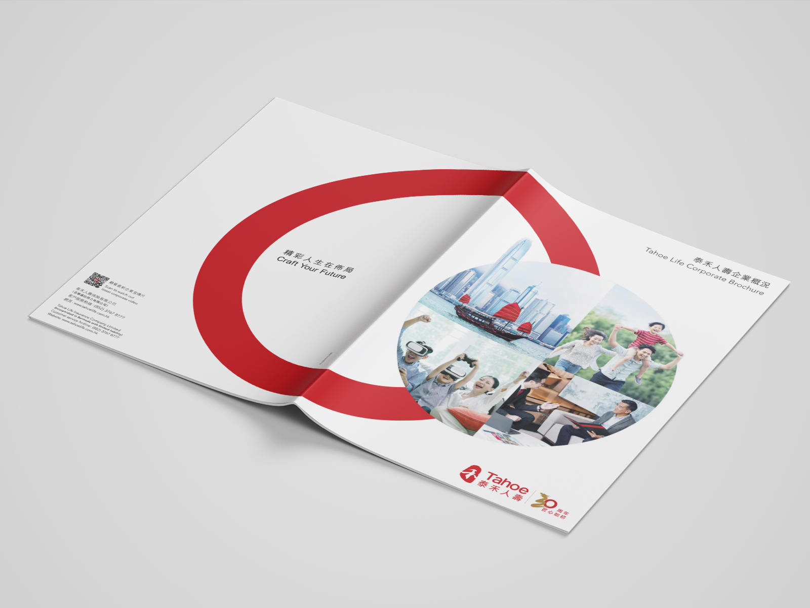
Our creative derives from the red "O" of the Tahoe Life 30th anniversary logo - The red "O" not only representing the "O" from the brand name and the number "30", but also echoing our client's advertising campaign "Realise Your Dreams for a Brillant Life". The red "O" connects varies landmarks from Hong Kong to Greater Bay area together, symbolizing the fact that our client is striving to craft a brilliant future for their customers within the region, while also making every effort to be a holistic life insurance provider and a leader in the world of life insurance.